
FGV Cadernos
redesign
Overview

FGV Projetos' flagship publication brought together expert perspectives on complex topics ranging from public policy and infrastructure to economic development and innovation.
The challenge was to transform a publication that felt dated into a contemporary editorial product capable of making dense content more engaging, readable, and visually appealing, while maintaining the institutional credibility expected from one of Brazil's leading academic and policy institutions.

What we accomplished
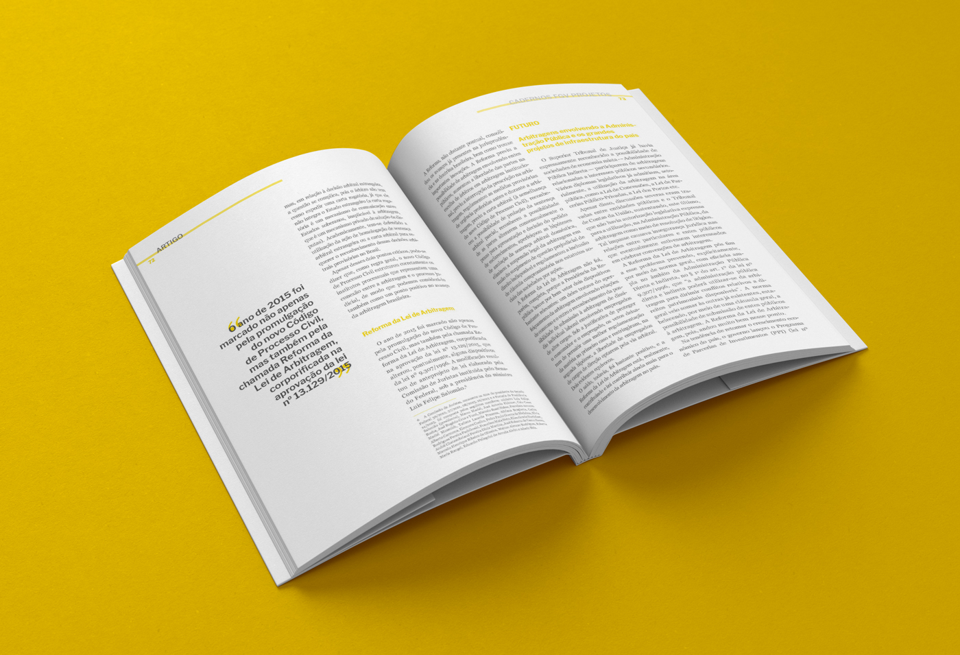
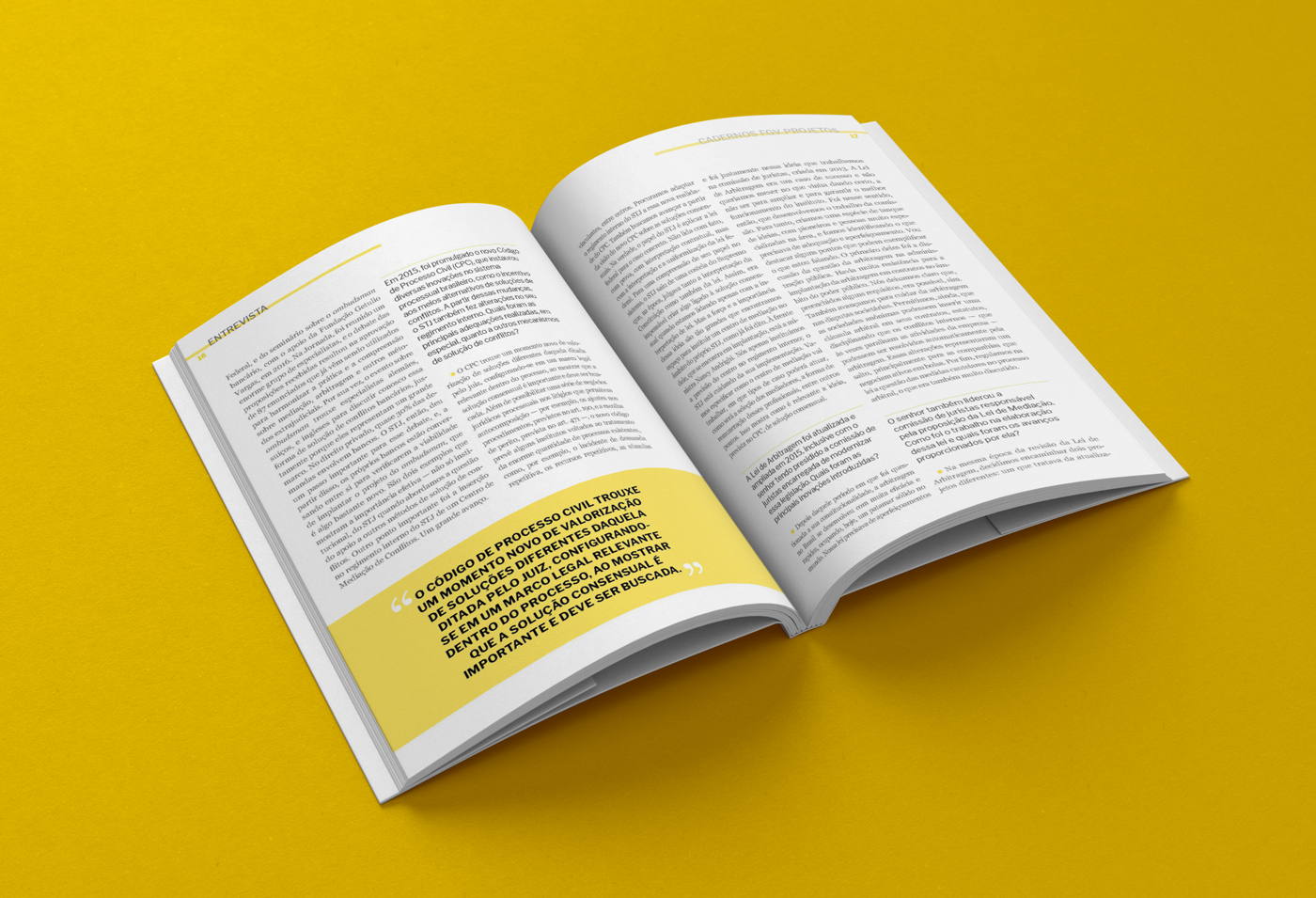
The redesign introduced a new editorial system that balanced long-form content with a more dynamic reading experience. Rather than treating articles as uninterrupted blocks of text, the new layout created a rhythm through the strategic use of imagery, pull quotes, highlights, and visual hierarchy.
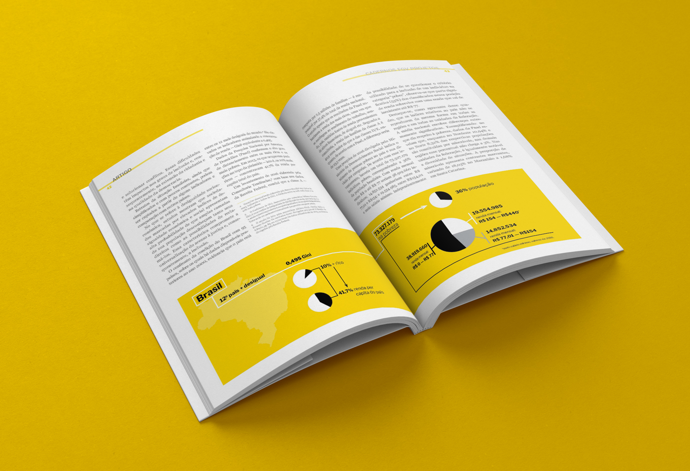
A key innovation was the introduction of infographics and data-driven visual elements. Prior editions relied almost exclusively on text, while the new approach identified opportunities to translate information into visual formats that were easier to understand and more engaging to explore.
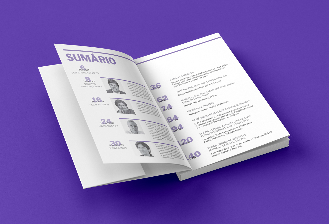
To maintain production costs while creating a distinctive identity for each issue, the publication adopted a two-color printing system using black and a single Pantone color that changed with every edition. This solution provided visual variety and strong shelf presence without increasing printing costs.
The result was a publication that felt contemporary, approachable, and visually coherent while preserving the authority and seriousness expected from an institutional publication.
Design Features
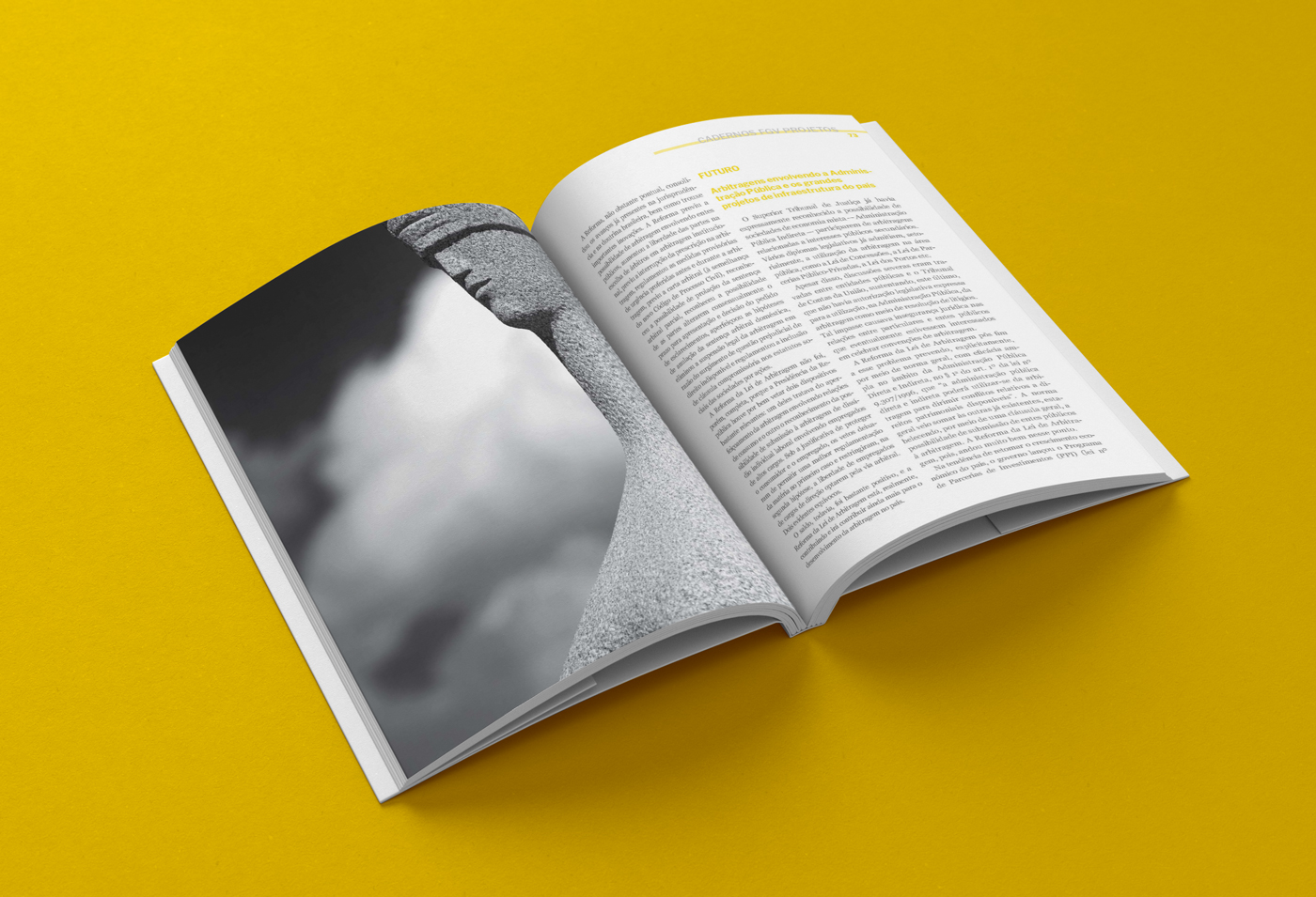
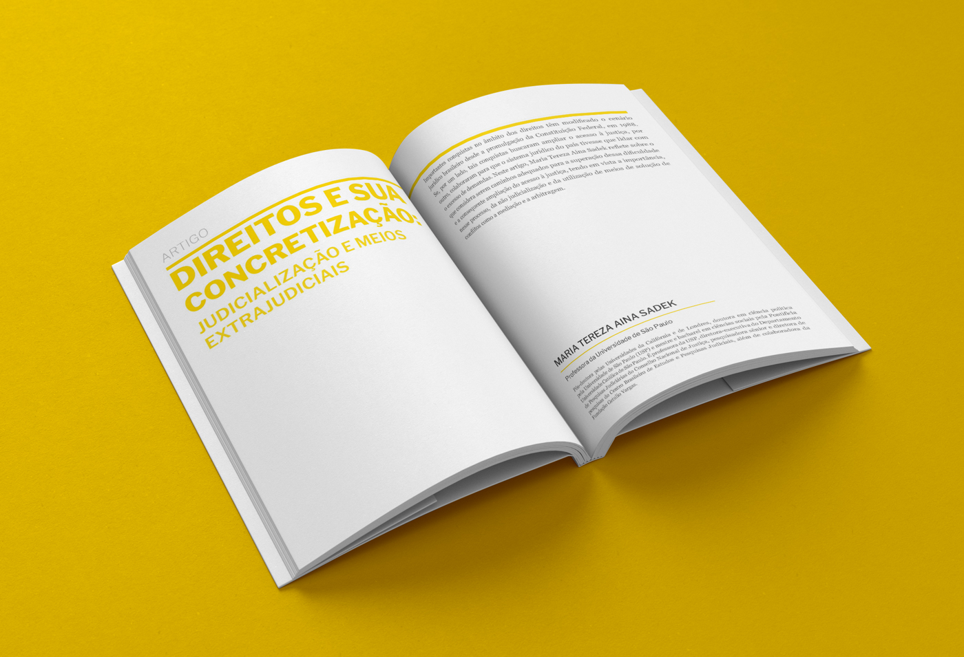
The editorial system was designed around flexibility and readability. Long articles were broken into digestible sections through a combination of typography, imagery, callouts, pull quotes, and information graphics.
Each edition adopted its own accent color, creating a recognizable yet evolving identity across the series. The restrained color palette encouraged disciplined use of hierarchy and ensured that visual elements supported the content rather than competing with it.
Special attention was given to pacing. Variations in layout density, image scale, and information hierarchy helped sustain reader interest across lengthy articles while maintaining a clean and professional aesthetic.
Key Features
- Editorial redesign of flagship publication
- Information design and infographics
- Long-form content strategy
- Two-color print production system
- Data storytelling
- Institutional publication design
- Multi-issue design system