
Evidence-to-Action Framework
Report
Overview
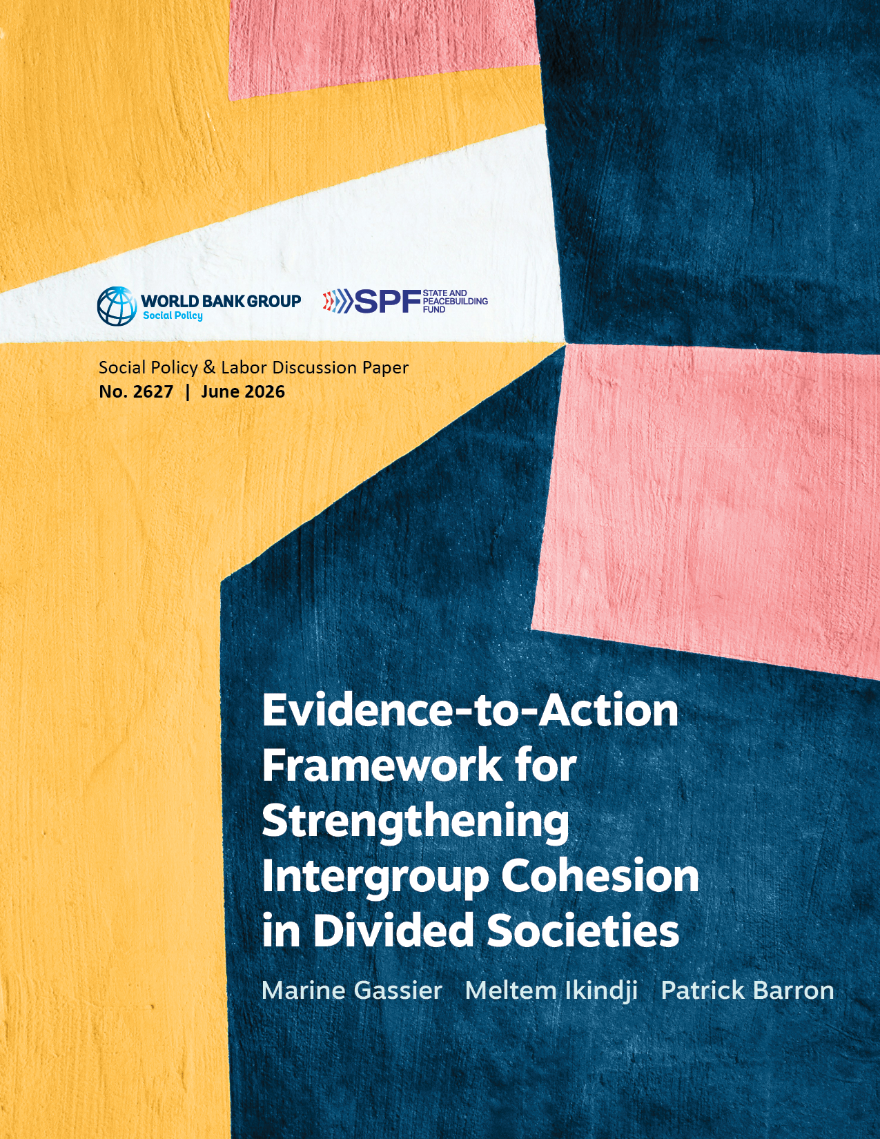
The Social Protection and Labor unit publishes a large volume of research, policy papers, and technical guidance. Evidence-to-Action Framework for Strengthening Intergroup Cohesion in Divided Societies required a digital-first approach that would remain easy to navigate across devices while preserving the visual identity of the Social Protection practice.
The challenge was to create a publication that felt recognizably part of the unit's ecosystem while maintaining high standards of readability, accessibility, and usability.

What we accomplished
Social Protection's visual identity relies heavily on yellow, a color that presents accessibility challenges when used for meaningful information or text. At the same time, the publication needed to accommodate complex content, extensive references, and frequent navigation between sections.
The design also needed to perform equally well on desktop and mobile devices, where traditional landscape report layouts often become difficult to read and can easily exceed recommended line-length limits for comfortable reading.
The final publication balances institutional branding, accessibility requirements, and digital usability. The result is a report that feels consistent with the Social Protection portfolio while remaining easy to navigate, read, and reference across devices.
Design approach
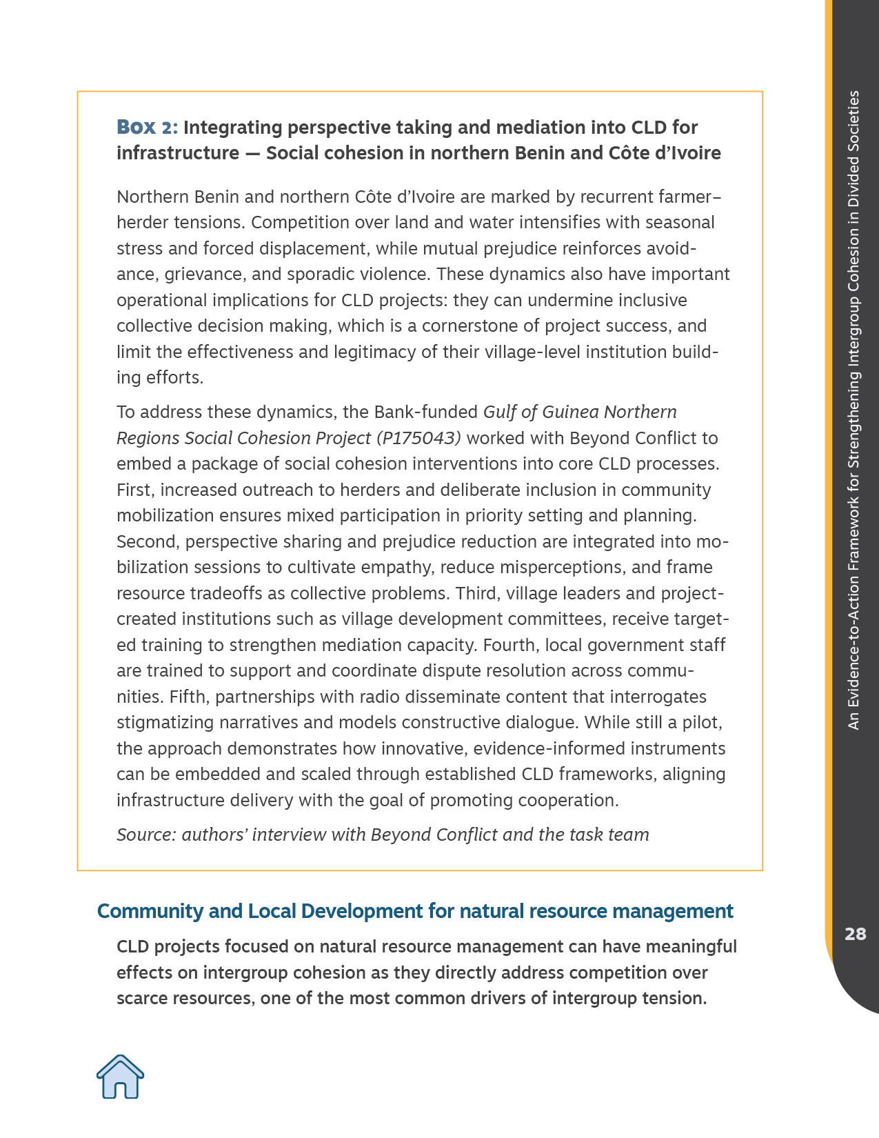
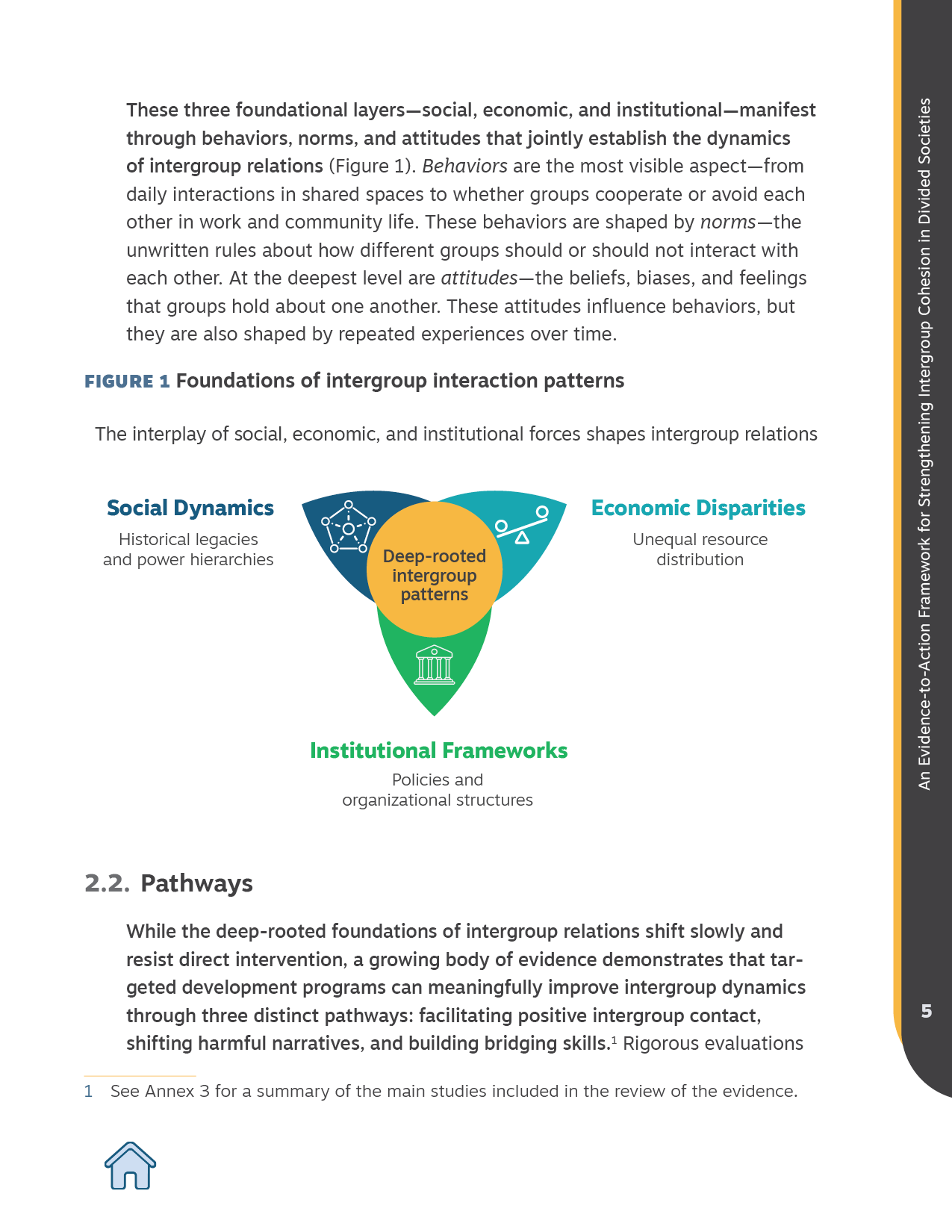
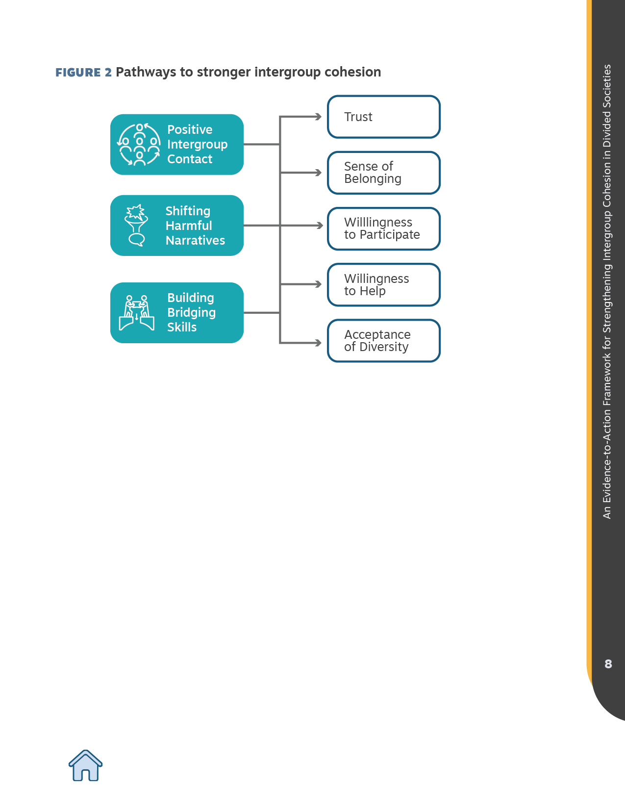
The report was designed as a digital-first publication. A portrait format was deliberately chosen to provide a more comfortable reading experience on mobile devices while maintaining appropriate line lengths and readability across screen sizes.
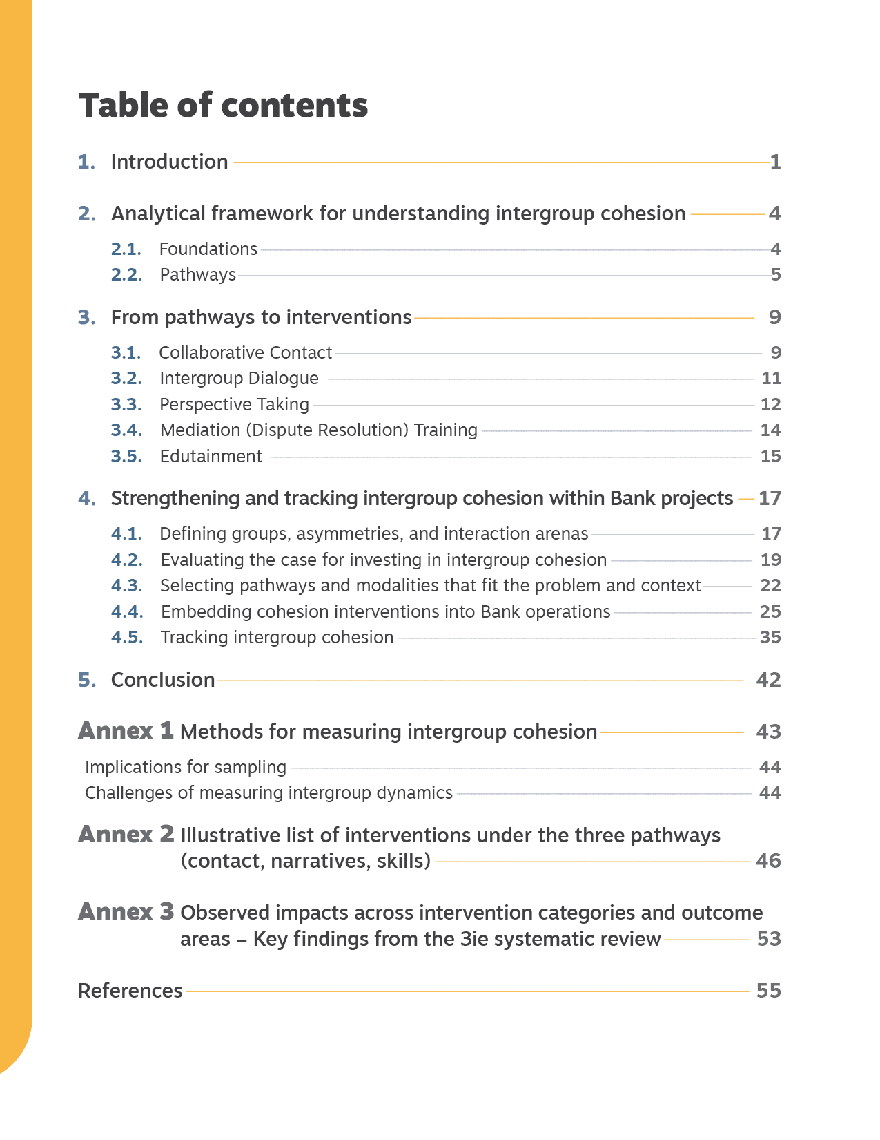
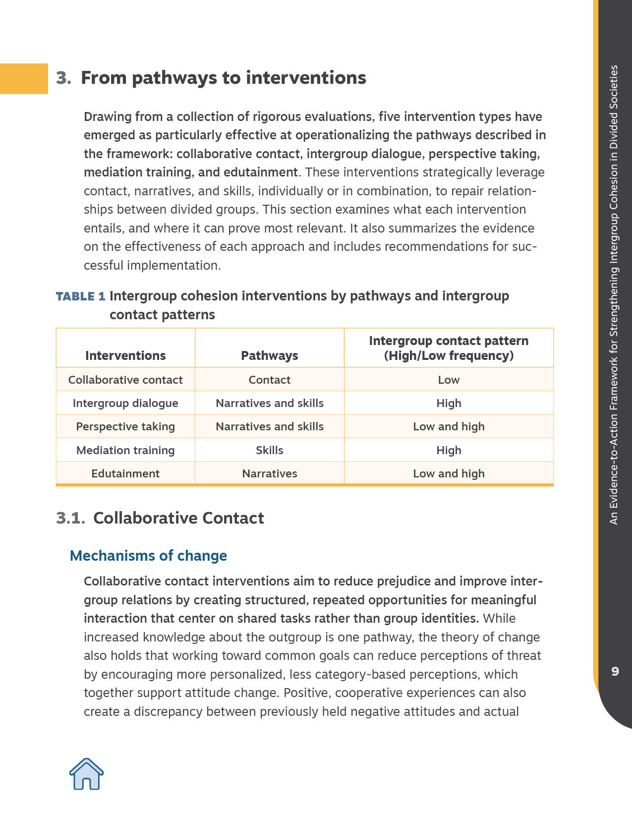
To strengthen navigation, the publication includes an interactive table of contents and persistent navigation elements that allow readers to quickly return to the main structure of the report from any page.
The visual system draws from the Social Protection unit's identity, using yellow as a supporting visual element rather than a carrier of information. This approach preserved brand recognition while ensuring sufficient contrast and accessibility throughout the publication.
Accessibility Considerations
Accessibility informed every major design decision.
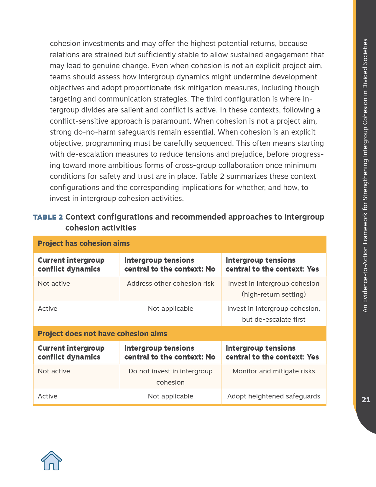
Yellow was reserved for decorative and navigational elements, never as the sole carrier of meaning. Information hierarchy, section identification, and content relationships are communicated through typography, layout, and structure rather than color alone.
The publication was designed to support comfortable reading, clear navigation, and consistent interpretation across devices and user needs.
Key Features
- Digital-first editorial design
- Interactive table of contents
- Persistent navigation system
- Accessibility-focused color strategy
- Mobile-friendly reading experience
- Cost-efficient visual identity framework
- Cost-efficient visual identity framework
- Cost-efficient visual identity framework
- Cost-efficient visual identity framework